CROSSROADS GLOBAL VILLAGE (UK):
Connecting people in a world of need
- Crossroads: connecting people in need and those who can help
- Truck: aid/welfare distribution
- Feet: x-periencing life in another’s shoes
- Tents: disaster services
- Water: environment
- Needle/thread: fair trade
- Soldier: victims of conflict
- Woman with basket: poverty alleviation
- Handshake: partnerships for change
- Kids: a better world for tomorrow
Crossroads’ GLOBAL X-PERIENCE:
Stepping into another’s shoes
- Feet: x-periencing life in another’s shoes
- Soldier: victims of conflict
- Woman: poverty
- Water: environmental need
- Tents: disaster need
- Raised hand: participants inspired to engage
- Barbed wire: breaking through oppression of poverty
Crossroads’ GLOBAL HAND:
Partnering for change
- Handshake: partnerships for change
- Turbines: environmental care
- Hammer/nails: income generation
- Stethoscope: medical need
- Sacks/pot/pitcher: community development
- Graduation cap: education
- Smart phone: digital inclusion
- Road: global reach
Crossroads’ GLOBAL HANDICRAFTS:
Fair trade for a fairer world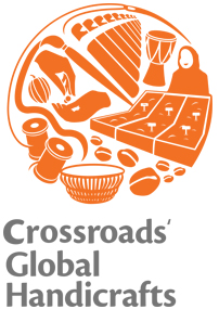
- Coins changing hands: fair trade/access to markets
- Drums/panpipes: cultural artifacts
- Paintbrush/bowl: arts/crafts
- Thread: textiles
- Coffee/coco bean: sustainable crops
- Woman with market stall: gender empowerment
The artist
There’s a story behind our logos.
When we first spoke to the designers, we told them we longed not only for designs which would convey professionalism, but also the story of Crossroads: our heart and vision.
A UK artist produced the concept. She did not choose a corporate style. She chose the style of art one finds among the very people whom we serve, while not tying it to any one culture or region. It’s not exactly Chinese. It’s not exactly African. It’s not exactly European. It’s the art of grassroots communities across the world: places where people are on limited incomes and often tell their stories on their walls and in their fabrics.
She made each logo into the shape of a globe to show the world-wide reach of the work. She added a touch of whimsy to convey joy, determined that, while these showed world need, they would not be depressing. So she portrayed a world, yes, with challenges, but one in which people are overcoming their challenges. Finally, she used colour. Many think of poverty as dull and grey, but we find the cultures combatting it are often rich with colour and life and wanted the logos to capture that too.
We are amazed. We can use any one of them to tell the story of this work, so richly has the design captured our vision and values.
The designers
When, in 1995, we realised Crossroads was starting, we thought we’d better have a logo. There was no designer involved. We just doodled on a computer and tried to pick a word shape that represented two roads crossing… (Well, you may have to squint a bit!) The result? A home-spun Crossroads logo. Over the years, as new aspects of our work emerged, different logos came with them. We were regularly advised to get our logos professionally designed, but we knew that would be expensive. With all the things in our lives that cost money, we weren’t sure we should spend our very few dollars on this.
Cost-free help came, unasked, though. A UK design firm, Thought Collective, offered to give us a professional re-design. They called on the services of a superb artist who did the basic work (story above) and sent it through for our feedback. As we responded, we learned that the artist had become ill and could no longer continue. With limited funds, the process again went into pause mode. A couple of years later, another design firm, Beck and Caul, this time from New Zealand, offered to finish off the logos, again, free of charge. This group went on to design the website you are looking at today.
Our depth of thanks to both design firms: